
The BIFL Workspace is reader-supported. We may earn an affiliate commission when you click links on this page, at no extra cost to you. Full Disclosure →
Most home office design advice optimizes for function and treats aesthetics as a finishing touch. This guide takes the opposite position: a workspace that you find genuinely beautiful is one you’ll want to spend time in, invest in further, and maintain with care. The aesthetic is not the decoration on top of the function — it’s part of what makes the function work.
This guide is for anyone building or redesigning a home office with the intention of keeping it for a long time — whether for yourself, a partner, or a spouse who spends the majority of their working day in this room. The design decisions here are made once and lived with for years. Getting them right at the outset is worth the extra thought.
Start With the Room, Not the Products
The most common home office design mistake is purchasing individual pieces in isolation — a desk here, a chair there, a lamp from one source, organizers from another — and hoping they’ll cohere. They rarely do. The pieces that look beautiful together in a finished workspace were almost always conceived as a system, or chosen within a clearly defined framework.
Before buying anything, define two parameters: your dominant material palette and your light environment. These two variables determine everything else.
Your Material Palette: Pick Two or Three, Commit
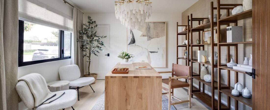
The most elegant home offices are built around a material palette of two or three complementary materials used consistently throughout the space. The combinations that work durably across aesthetic trends:
- Walnut + leather + brushed brass: warm, traditional-leaning, deeply rich. Walnut desk, leather chair and desk pad, brass lamp and hardware. The cognac leather desk pad from Fortivox was designed for exactly this palette.
- White oak + linen + matte black: Scandinavian-influenced, clean, and light. White oak desk and shelves, linen upholstered chair, matte black lamp and monitor arm.
- Marble + white + gold: the cleanest and most formal palette. White desk or marble-topped surface, white walls, gold accent hardware. Works best in rooms with strong natural light.
- Dark walnut + navy + cream: the palette this site is built around — deep, editorial, confident. Navy walls or dark shelving, walnut desk surface, cream or leather accessories.
The discipline is applying the chosen palette consistently rather than allowing exceptions. One piece that violates the material language — a plastic-and-chrome monitor stand on a walnut desk, for example — draws the eye immediately and undermines the coherence of everything around it.
Your Light Environment: Natural Light First, Task Light Second
Natural light is the most powerful and least expensive design element in any room, and home office design should prioritize it before any other decision. The ideal home office has its primary light source — a window — positioned to the side of the desk rather than directly behind or in front of the monitor. Light from behind the monitor creates glare on the screen. Light from behind the seated position creates a silhouette effect that makes video calls look like you’re in a witness protection program.
Side lighting from a window creates the most flattering, functional, and beautiful illumination for a workspace. If window position can’t be changed, the solution is a high-quality monitor-mounted light bar (BenQ ScreenBar, $109) that illuminates the desk surface without touching the screen face.
Task lighting — your desk lamp — should complement the natural light, not compete with it. During daytime hours, a lamp at 2700K–3000K (warm white) provides fill light without washing out the natural light. In the evening, a tunable white lamp that can shift between warm and cool is the BIFL choice for an office used at all hours.
| ✅ TIP Paint color interacts with both natural and artificial light more than any other single design decision. North-facing rooms receive cool, consistent light all day — warmer paint tones (cream, warm white, warm greige) compensate beautifully. South-facing rooms receive warm direct light — cooler tones (cool white, soft blue-gray, sage) prevent the room from feeling washed out. Dark paint in a home office (navy, deep green, charcoal) works best with excellent artificial lighting. It creates a sophisticated, enveloping quality but requires deliberate lighting design to avoid feeling dim. |
The Furniture Hierarchy: Desk First, Then Everything Else
Every other piece of furniture in a home office relates proportionally to the desk. The desk’s size, height, material, and orientation establish the visual center of gravity of the room. Choose it before choosing anything else, and choose it as if you’re never replacing it.
The BIFL desk for an aesthetic-forward office: solid wood surface on a quality frame. Solid bamboo, walnut, or white oak tops are the most visually warm materials and the most aligned with a design-forward space. A standing desk with a solid wood top and a quality motorized frame — UPLIFT Desk’s solid bamboo or rubberwood options, for example — solves both the ergonomic and aesthetic requirements simultaneously.
Desk size relative to room size is the most commonly misjudged variable. The rule: the desk should not touch more than one wall in the room unless it is specifically designed as a corner piece. A desk pushed against a wall and running its full length gives a room a cramped, functional-only quality that no amount of styling will overcome. Pull the desk away from the wall to allow some negative space behind it. The room immediately feels larger and more intentional.
The Chair: The Design Piece That Has to Work
An ergonomic chair is uniquely challenging from a design perspective because it’s the largest single piece of furniture in the room after the desk, and the design constraints of genuine ergonomics — the adjustable arms, the mesh back, the pneumatic cylinder — look distinctly functional rather than residential.
The solutions that work aesthetically without compromising ergonomics:
- Herman Miller Aeron in Studio Nightfall or Mineral: the Aeron’s lighter colorways read as design objects rather than office furniture in a way the standard graphite version doesn’t. Mineral in particular photographs beautifully against warm wood desk surfaces.
- Steelcase Leap or Gesture in Cogent: Connect (a warm, almost terracotta textile): Steelcase’s textile options significantly affect how their chairs read in a residential context. The Cogent Connect fabric in the warmer colorways transforms an ergonomic chair from office equipment into something that looks chosen.
- Branch Ergonomic Chair in any of their muted tones: Branch’s design language is more residential than most ergonomic chairs at their price point ($499). The Ghost Chair (fully transparent) and the Verve Chair are designed to visually recede — appropriate in rooms where you want the desk, lighting, and accessories to carry the aesthetic weight.
Walls and Vertical Space: The Underutilized Design Asset
The wall space above and behind a desk is the most underutilized design asset in the typical home office. A blank wall behind a workspace makes the room look unfinished regardless of what’s on the desk. The three approaches that work with consistent elegance:
Gallery Wall — Curated, Not Cluttered
A tightly curated gallery wall — three to five pieces in related frames, arranged with deliberate spacing — transforms the wall behind a desk into a visual anchor for the room. The discipline is curation: every piece should relate to the others by color, theme, or frame material. A mix of framed prints, photographs, and one or two three-dimensional objects (a small mounted shelf with objects on it, for example) creates depth that a flat gallery wall doesn’t have.
The frame material should be chosen from your established material palette. Walnut-toned wood frames for a warm palette. Black metal frames for a minimal or Scandinavian palette. Brass or gold frames for a formal or maximalist palette.
Shelving as Display and Storage
Floating shelves above a desk serve three purposes simultaneously: they add storage for items that would otherwise be on the desk surface, they create a vertical visual element that draws the eye upward (making the room feel taller), and they provide a curated display surface for objects, books, and plants that communicate the personality of the space.
The BIFL floating shelf for this use: solid walnut or white oak, 1.5″ thick, properly anchored. The Shelfology standard floating shelves in white oak are an excellent choice. Style with a combination of books (spines facing out for legibility, or facing inward for a cleaner monochromatic look), one or two small objects of visual interest, and a trailing plant.
A Single Statement Piece
In some rooms, the right move is not a gallery arrangement but a single large-scale piece that anchors the wall completely. A large architectural print (30″ × 40″ or larger), a piece of original art, or a mirror in a decorative frame can do more for a room than six smaller pieces. The larger the piece, the more it reads as intentional rather than provisional.
Desk Surface: The Room’s Most Photographed Square Footage
The desk surface is the part of the room that appears in every video call, every home office photograph, and every background of every presentation. It’s also the surface you interact with for 8+ hours a day. Getting it right matters both visually and practically.
The essential principle: less is more, and what remains should be worth keeping. A desk surface with five carefully chosen objects of quality — a leather desk pad, a single quality desk lamp, a pen cup in a material that matches the palette, one plant, and a monitor on a proper arm — is dramatically more beautiful and more functional than a desk covered with 20 items, half of which are there because they don’t have anywhere else to go.
The leather desk pad as the design foundation: a full-grain leather desk pad in cognac or black functions as the ‘rug of the desk’ — it establishes the material warmth and visual texture of the entire surface, and every object placed on it is framed by it. The quality of this foundation piece has an outsize effect on the quality of the whole.
Plants: The Detail That Changes Everything
A single well-chosen plant in a quality pot has more design impact per dollar than almost any other element you can add to a home office. The reason is biological: the presence of living plants registers to the human visual system as different in kind from manufactured objects — there’s an inherent vitality to organic form that no photograph or print replicates.
For a home office: choose plants that tolerate low-to-medium light and irregular watering, because the demands of work make consistent plant care easy to forget. The pothos (trails beautifully on shelves), the ZZ plant (architectural form, nearly indestructible), and the snake plant (structural, sculptural, nearly indestructible) are the three most design-appropriate and care-forgiving options. A ceramic pot in a muted tone from your palette — cream, warm white, terracotta, matte black — completes the object.
✦ WHERE TO BUY✦ SHOP THE LOOK
► UPLIFT Desk (solid bamboo or rubberwood top): The BIFL standing desk recommendation for design-forward setups.
► Herman Miller Aeron (New Colors just dropped. Check out the Mineral or Nightfall for a clean and polished look.)
► Branch Ergonomic Chair Pro: Best value ergonomic chair with a residential aesthetic.
► Shelfology floating shelves (white oak)
► Grovemade desk accessories: Solid walnut and steel desk objects designed as a coherent system.